FractaLog

a non-linear space for students of chaos and fractals....

Entries in Visualization (6)

Wednesday
Apr022008

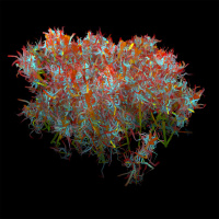
The Face of Spam

spam_plants07.jpgUugh.. who would want to look at anything remotely representative of two of the most hideously ugly realities of online life?

Alex Dragalescu, that's who. Dragalescu, a Romanian visual artist, often uses analyses of spam and other annoyances to drive visualization schemes, producing highly-organic-looking computer-generated images. (And, in this case, a nice example of meta-imagery: CGI's of nasty things that see their birth, and are spread, via computers.)

For example, Alex uses "the ASCII values found in the text of spam messages determine the attributes and qualities of the Spam Plants."

The graphic in this post is from Spam plants.

His latest series is entitled Malwarez, which is

a series of visualization of worms, viruses, trojans and spyware code. For each piece of disassembled code, API calls, memory addresses and subroutines are tracked and analyzed. Their frequency, density and grouping are mapped to the inputs of an algorithm that grows a virtual 3D entity. Therefore the patterns and rhythms found in the data drive the configuration of the artificial organism.

This is all fascinating, fractal stuff, and is in the spirit of other visualization projects posted on fractalog.

Wednesday
Jun132007

Relative Time and Swiss Clocks

einsteinclock.jpgThe recent books on Einstein by Isaacson and Neffe (see reviews) cover the development of special relativity in great depth, with special attention to the development of an operational definition of time duration that vanquishes the prior notion of simultaneity. Indeed, simultaneity is now accepted as observer-dependent, thanks to Einstein's Special Theory.

Both books do refer to the role played by Poincaré- although "role" is not necessarily the operative term here. No doubt Poincaré was thinking deeply about time, but did not make Einstein's leap to codify the relative nature of time duration.

An excellent book on the Einstein/Poincare connection is Einstein's Clocks, Poincaré's Maps: Empires of Time, by Peter Galison. Here Galison tries to relate Einstein's experience as patent clerk who most likely saw patent proposals for clock synchronization between different Swiss cities to his ongoing thought -experiments in the foundations of physics. ( In a generally very favorable review by R. Wald for Physics Today, this idea is called into question.)

But the Poincaré connection is fascinating because it is not clear to what extent, if any, Poincaré's writings on time were even seen by Einstein. (And the title of the book is itself a play on words, because a Poincaré Map is a fundamental analysis/visualization tool of chaos and fractals.)

The new Einstein bios have really opened up new avenues of thought on how Einstein came to be Einstein. The Poincare connection is fascinating, and a potentially important piece of the answer.

Most amazing of all is the pictures these books paint of the intellectual ferment taking place in Europe at the end of the 19th and beginning of the 20th century. It is hard to imagine a similarly exhilarating time of new, earth-shattering theories that can possibly duplicate these years for excitement and creative brilliance.

Monday
Jun112007

Visualizing The Core of the Blogosphere

583047-868907-thumbnail.jpg
Interactive map of blogosphere. From Hurst. Click to enlarge
There's been a recent flurry of articles concerning visualization of the web itself, and what such visualization might say about the social networks that live and breathe because of the abilities of the net.  This topic is a necessary follow-up, then, to my previous posts on new visualization techniques in web searching.

A conference at UPenn in June 2006 titled The Hyperlinked Society focused on "the effects of digital links on people’s ability to understand and care about their larger society. " The following blurb is from the intro page; the program was quite ambitious:

Most internet users know hyperlinks as highlighted words on a web page that take them to certain other sites. But hyperlinks today are quite complex forms of instant connection—for example, tags, API mashups, and RSS feeds. Moreover, media convergence has led to increased instant linking among desktop computers, cell phones, PDAs, MP3 players, digital video recorders, and even billboards.

Through these activities and far more, “links” are becoming the basic forces that relate creative works to one another. Links nominate what ideas and actors have the right to be heard and with what priority. Various stakeholders in society recognize the political and economic value of these connections. Governments, corporations, non-profits and individual media users often work to digitally privilege certain ideas over others.

Do links encourage people to see beyond their personal situations and know the broad world in diverse ways? Or, instead, do links encourage people to drill into their own territories and not learn about social concerns that seem irrelevant to their personal interests? What roles do economic and political considerations play in creating links that nudge people in one or the other direction?

Click to read more ...

Thursday
May312007

Visualizing Web Pages - HTML Graphs

583047-846866-thumbnail.jpg
FractaLog web graph. Click to enlarge.
As an interesting follow up to my recent post on KartOO and Google Browser, check out the HTML Graphlet applet created by Sala (no last name), and posted on the Aharef blog. To use the applet, just enter the URL of the page to be graphed.

The applet constructs multi-colored graph of nodes and edges, with each color representing a different HTML tag. As the graph is produced, it grows outward, with branches sprouting - all in a very kinetic/organic way.

The color of the nodes refer to specific HTML tags:

blue: for links (the A tag)
red: for tables (TABLE, TR and TD tags)
green: for the DIV tag
violet: for images (the IMG tag)
yellow: for forms (FORM, INPUT, TEXTAREA, SELECT and OPTION tags)
orange: for linebreaks and blockquotes (BR, P, and BLOCKQUOTE tags)
black: the HTML tag, the root node
gray: all other tags 


The image at the top of this post is a map of FractaLog as of the date of this posting.

Sala asks that those with flickr accounts post a screenshot of their site tree, using websitesasgraphs for a tag. Click on this link to see a wide variety of web page graphs.

Some of these graphs are more fractal-like than the others. I can only hope that someday the FractaLog graph will look suitably fractal to deserve its name.

Friday
May252007

Web Search Visualization & Fractal Maps

583047-844805-thumbnail.jpg
KartOO fractal search. Click to enlarge.
There is a growing trend in using connectivity-visualization mapping when web searching. Search engines such as KartOO and TouchGraph Google Browswer, attempt to show the linkage among web sites/pages by web-like 2-D graphics, where colors and icon-sizes indicate the strength of the site linkages. The effect can be described best as a "concept map", with nodes representing sites, and connections between nodes representing links. Of the two engines, KartOO is much more visually interesting. (I have included screen shots produced by each engine in a search for "fractal".)

Whether this enhances the search experience is debatable - at present. While KartOO's pr claims that the non-linear nature of the way information is distributed on the internet should be matched in the non-linear nature of the visualization, so far I haven't seen anything that makes me want to switch from Clusty, which does a great job of organizing themes in web searches, and provides the links/themes in a nice old-fashioned list.

I find the same lack of compelling features for the Touch Graph Google Browser. I should note that TouchGraph is a company that designs custom-tailored visual search features for other companies and projects, with a focus on "creating tools that enable decision makers to display, navigate, and analyze complex data simply and intuitively...Individuals and organizations have more vital information at their fingertips than ever before. Traditional search engines provide a way to sift through this data. However, the greatest insights can be achieved not by sifting, but by looking at the big picture to see how items are connected."

583047-844829-thumbnail.jpg
TouchGraph fractal search. Click to enlarge.
I'm still underwhelmed by what the visual engines do that's better than Clusty. They do produce some fascinating, kinetic displays, because nodes and connections expand when clicking on different parts of the graphic display, and various pop-ups appear with further detail about the sites. Because clicking often produces new sets of nodes, there is a fractal-like quality to the search map. I can see the efficacy of such a search for different types of data, or business functions, but I doubt that they will become the main search option for an ordinary web search.

Thursday
May172007

Imagery in Art and Science - from da Vinci to the Desktop

583047-824692-thumbnail.jpg
da Vinci catheterized? See below for details.  Click to enlarge
Readers interested in more of the science-art boundary should check out the review by Bettyann Holtzmann Kevles in the May 2007 Scientific American. Titled The Interplay of Art and Science,the piece is an in-depth look at two books by Martin Kemp:

Leonardo da Vinci: Experience, Experiment and Design
and
Seen/Unseen: Art, Science, and Intuition from Leonardo to the Hubble Telescope

(Note: Kemp is a frequent contributor to the Science in Culture column in Nature. A leading expert on da Vinci, he is professor of art history at Oxford.)

According to Kevles, a common theme in both books is how art affects imagery in science and science affects imagery in art, which leads to some very interesting and provocative ideas about digital imagery.

Two parts of the review are of particular interest. In one, Kevles describes how Kemp relates D'Arcy Wentworth Thompson's analysis of the shape and size of living organisms spelled out in his famous work On Growth and Form to the "visual mathematics of fractals, chaos theory and machine-made images."

Continuing with the idea of the connection between visual imagery, art, science, and life, Kevles closes with some of Kemp's concerns about the imagery produced by science (e.g. in the form of medical imaging technology) and the reality behind it. The following is an excerpt: (See Kevles' full review for much more)

Click to read more ...